
I have moved my ongoing work to a new blog, which can be accessed here.
Hot Needle of Inquiry
Continuing the theme of naming apps after famous starship names in literature (I do consider science fiction to be literature?) from Larry Niven’s Ringworld series here is the Hot Needle of Inquiry.
It’s a preliminary app, and in the current form it simply calculates sector correlations going back a couple of years. I will be adding sentiment, factors, and a correlation matrix. In structure, it’s an R Markdown document hosted at RStudio. In practice, I was curious to learn how to create an interactive R Markdown document and many thanks for the help from the people at RStudio – this my first stab at it.
I’m actually just calculating the unweighted sector average daily return against the S&P 500 average daily return and doing a rolling correlation. I may decide to weight the returns by market cap, but I’m still mulling that over. For now, it’s the simple version.
Thanks for the feedback as always, I can be reached at jed at sentieo.com and please check out all the cool stuff we’re doing at Sentieo!
Starship Troopers
For a start, here are three “alpha” apps for pairs trading the S&P 500, all to be part of a future platform or dashboard for long/short stock picking powered by data-science engineering.
For fun, I decided to name the series of apps after science fiction spaceships from books (not movies) from my youth. All use the tidyquant and tidyverse libraries for R, and all are hosted by the platform at RStudio.
As a portfolio manager at a hedge fund, I was often asked to hedge my ideas with stocks that traded similarly and were at good entry points for pairs trading. These tools help answer the thorny questions that arise when hedging: is this a good pair? and is this a good time to enter that pair trade?
Lazy Eight: allows for filtering and sorting by z score, weekly returns relative, and daily returns relative to index and sector.
https://jedgore.shinyapps.io/lazy_eight/
Separately, if you have a single stock to hedge, you can compare it specifically with its peers using, er, Drunkard’s Walk (with a nod to the EMH):
https://jedgore.shinyapps.io/drunkards_walk/
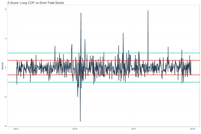
Lastly, if you find a pair trade you like, you can see the history of its trading on a z score chart using Far Star:
https://jedgore.shinyapps.io/far_star/
I plan to add backtesting charts to Far Star (trades initiated at standard deviation limits) as an analytical supplement to the r-squared which appears on the lower right of the z score chart.
What’s next? Hot Needle of Inquiry (again from Larry Niven, who really does have the best ship names) will attempt calculate sector-based correlations for use as identifying the expected return on assuming stock-picking long/short risk. After that I want to tackle more factor-based analysis and more sentiment analysis.
Please report bugs to jed at sentieo.com! I will be expanding these ideas in coming weeks.
Here is an Excel Workbook which shows the calcs for Lazy Eight for AAPL. Did this to test the code but it also shows in Excel form what’s going on under the hood.
Sources:
Far Star
Drunkard’s Walk – “Grendel,” a short story in Larry Niven’s short story collection Neutron Star
Lazy Eight I – Larry Niven’s novel World of Ptavvs
Beyond Correlations: A Simple Trading Dashboard for the Energy Sector
Another in a series of examples of R at work, this is a simple sector analysis of the energy sector in the S&P 500 using R and one of my favorite libraries: Tidyquant from the engineers at Business Science. Check out their site – they have a bunch of great examples on how to use R in business.
I’ve been remiss of late including code, but I’ve added much of it to the bottom of this post in this case. I’m happy to engage in discussion or debate with anyone else who has a passion for investing with data science tools. I can be found on Linkedin, for now. My github is coming soon.
Correlations? Just the First Step
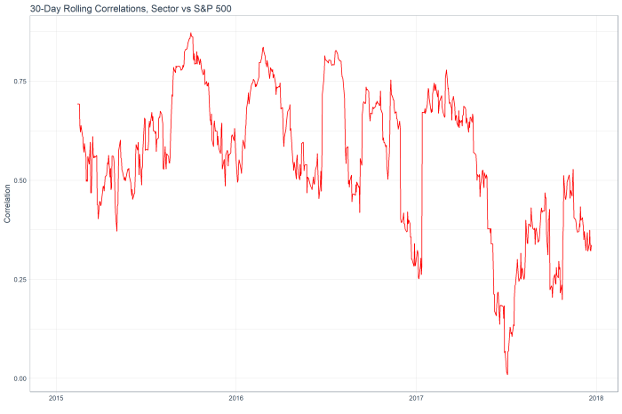
The following is the 30 day rolling correlation of the 34 stocks in the Energy sector with the S&P 500.
While the correlation fell through the year as oil prices declined and tech stocks rallied, the sector has shown increasing market correlation of late.
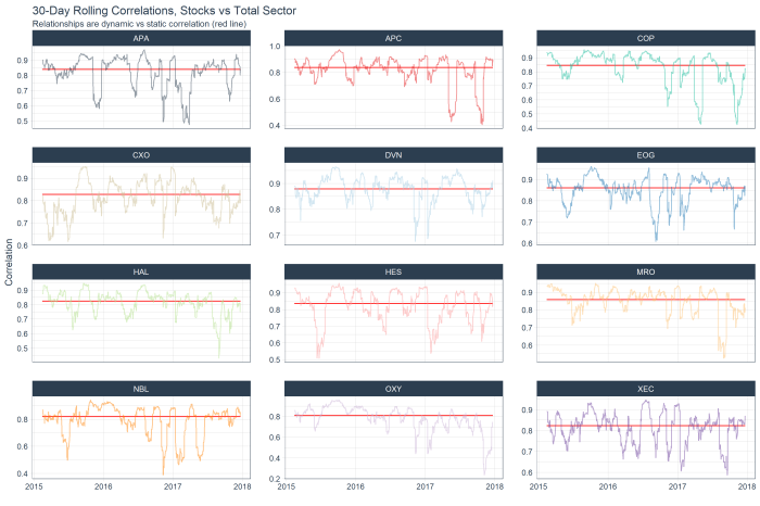
The following chart shows the top 12 stocks by correlation with the overall sector (red line) and their rolling correlation trend. With this analysis alone, I don’t see much in the way of interesting ideas. Everything appears to have mean-reverted already!
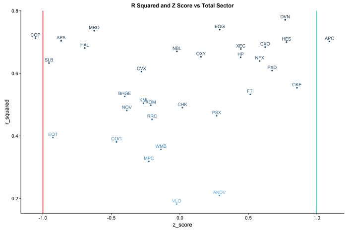
However, we can dig deeper into the idea of relationships between stocks / sector by moving past correlations and into z-scores and regression model fits.
R Squared vs Z Score by Stock and Total Sector:
R Squared: The “goodness of fit”” of a linear regression of daily log returns by each stock against the total sector.
Z-Score: the measure of the current standard deviation of the daily spread of each stock’s return against that of the total sector.
Put the two ideas together, and you have a trading dashboard for the sector.
The lines in the chart are at the -1 and +1 standard deviations.
In this example, COP shows an r-squared of ~.75 and greater than -1 standard deviation from the mean of the sector, suggesting a mean reversion long. By contrast, APC shows an r-squared of ~.75 and a z-score of > 1, suggesting a mean reversion short vs the sector.
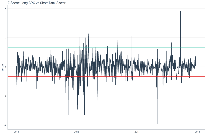
The z score chart for APC shows a mean reversion relative short, as the red line is 1 standard deviation out, and you can see this stock tends to mean revert.
While the z score chart for COP shows a mean reversion relative long.
Code below. Ping me with any questions / ideas at jed at sentieo.com!
library(tidyquant)
sp500_stocks <- tq_index(“SP500″) #load sp500 stock symbols
stocks<-sp500_stocks %>%
filter(sector==”Energy”) #filter only the energy sector
#get prices
stock_prices <- stocks %>%
tq_get(get = “stock.prices”,
from = “2015-01-01”,
to = “2017-12-25”) %>%
group_by(symbol)
sp500_prices <- c(“^GSPC”) %>%
tq_get(get = “stock.prices”,
from = “2015-01-01”,
to = “2017-12-25”)
#calculate daily log returns
stock_pairs <- stock_prices %>%
tq_transmute(select = adjusted,
mutate_fun = periodReturn,
period = “daily”,
type = “log”,
col_rename = “returns”) %>%
group_by(date) %>%
mutate(average_sector=mean(returns)) %>%
ungroup() %>%
spread(key = symbol, value = returns)
#calculate daily log returns
sp500_returns <- sp500_prices %>%
tq_transmute(select = adjusted,
mutate_fun = periodReturn,
period = “daily”,
type = “log”,
col_rename = “returns”)
stock_returns_long<-stock_pairs %>%
gather(symbol,daily_return,-date,-average_sector)
#add rolling corr vs s&p
top_symbol<-stock_returns_long %>%
group_by(symbol) %>%
summarise(n=n()) %>%
head(1)
sp500_rolling_corr<-stock_returns_long %>%
filter(symbol==as.character(top_symbol[[1,1]])) %>%
select(date,average_sector) %>%
inner_join(sp500_returns,by=”date”) %>%
mutate(sp500_return=returns) %>%
tq_mutate_xy(
x = sp500_return,
y = average_sector,
mutate_fun = runCor,
# runCor args
n =30,
use = “pairwise.complete.obs”,
# tq_mutate args
col_rename = “rolling_corr”
)
stocks_rolling_corr<-NULL
stocks_rolling_corr <- stock_returns_long %>%
na.omit() %>%
group_by(symbol) %>%
# Mutation
tq_mutate_xy(
x = daily_return,
y = average_sector,
mutate_fun = runCor,
# runCor args
n =30,
use = “pairwise.complete.obs”,
# tq_mutate args
col_rename = “rolling_corr”
)
####GENERIC MODEL FIT
r_squareds<-stock_returns_long %>%
nest(-symbol) %>%
mutate(model=purrr::map(data,~lm(daily_return~average_sector,data=.))) %>%
unnest(model %>% purrr::map(broom::glance)) %>%
select(symbol,r.squared)
z_score<-function(data) {
data<-data %>%
mutate(z_score=(diff_series-mean(data$diff_series))/sd(data$diff_series)) %>%
select(date,z_score)
return(data)
}
current_z_scores<-stock_returns_long %>%
mutate(diff_series=daily_return-average_sector) %>%
nest(-symbol) %>%
mutate(zscore=purrr::map(data,z_score)) %>%
unnest(zscore) %>%
filter(date==max(date)) %>%
arrange(z_score)
#PLOT RSQ and ZSCORE
gplot_rsq_z<-inner_join(r_squareds,current_z_scores,by=”symbol”) %>%
mutate(r_squared=r.squared) %>%
ggplot(aes(y=r_squared,x=z_score,colour=-r.squared)) +
geom_point() +
geom_text(aes(label=symbol),size=4,vjust=-.5) +
geom_vline(xintercept = -1, size = 1, color = palette_light()[[2]]) +
geom_vline(xintercept = 1, size = 1, color = palette_light()[[3]]) +
labs(title=”R Squared and Z Score vs Total Sector”) +
theme(legend.position=”none”)
More Transcript Sentiment with R: Information Technology Sector
Adding to the previous post on transcript sentiment, I took a deeper dive into the popular Information Technology sector, using data and analysis from the parsing engines at Sentieo, the R libraries tibbletime, tidyverse, and a cool brand-new package of palette colors called dutchmasters.
As usual, I’ll keep the commentary very concise, but feel free to reach out to me (jed at sentieo.com) to discuss my favorite topic: investing with data (and a little science).
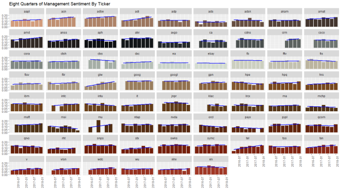
This busy chart below shows the various stocks in the sector with eight quarters of management sentiment, along with a blue regression slope lm() line. We can see stocks like ACN and ADBE and VRSN with clear uptrends, contrasted by downtrends in INTU, FIS, and MSI. We’ll return to this chart later.
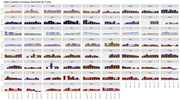
Running the same analysis for analyst sentiment, we see uptrends at IBM, ADP and DXC, and downtrends at NVDA, ACN, and VRSN.
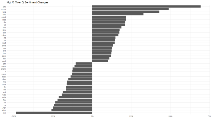
For a quick look at which stocks had the biggest changes (>10%) quarter over quarter, for management …
and analysts…
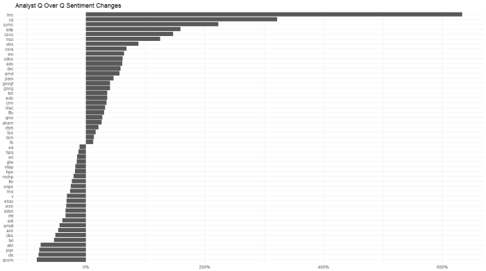
analysts got a lot more bullish on ADP and a lot less on QCOM. Oddly, QCOM management had the opposite change in their commentary. This type of divergence is worth digging into.
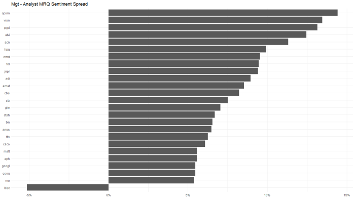
Looking at the chart below, QCOM, VRSN and PYPL had the largest divergence between positive managements and more negative analysts quarter to quarter. KLAC showed the opposite trend.
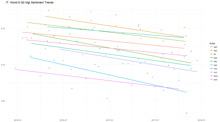
Looking at a longer 8 quarter trend of management sentiment, the worst slopes occur for PAYX and ORCL.
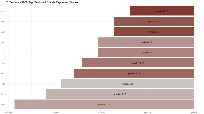
Which begs the question of – ok those are the slopes but what are the model fits for these individual stocks … that is, for which of these slopes is the regression actually significant. I wrestled with this issue for a bit, and landed on the following chart which shows p-value (loosely, goodness of fit) as color and with a label for the worst sentiment trend stocks in the Tech sector. ORCL stands out as having a significant and statistically significant downtrend.
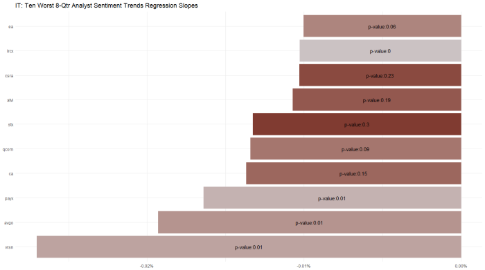
Applying the same approach to the analyst data: QCOM STX and VRSN are unpopular.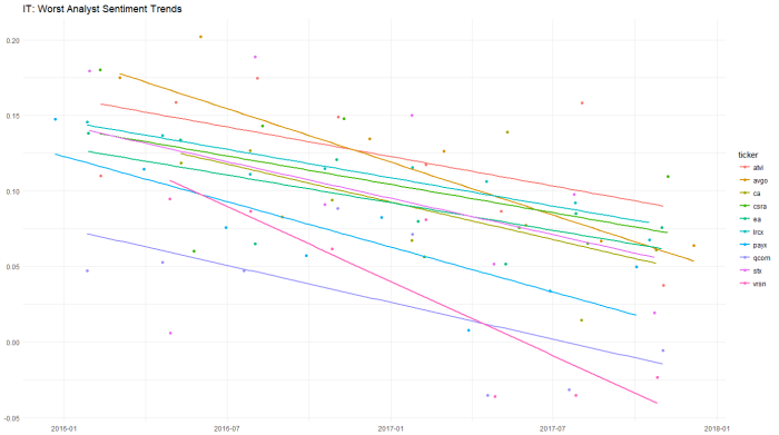
But the best model fits are PAYX AVGO and LCRX for negative trends.
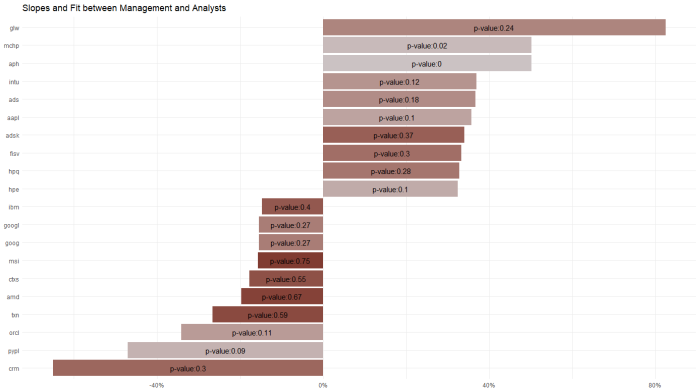
And, in an attempt to put it all together, I regressed management sentiment against analyst sentiment in a similar approach to the p-value charts above.
The significance of this chart is PYPL shows the biggest statistically significant divergence between management and analyst sentiment over an 8 quarter period (I’d prefer to see p-values < .05 per the rule of thumb applied to this stat, but simply speaking on an ordinal basis). Recall from the first two charts in this post that PYPL had showed a modest uptrend in management sentiment and a modest downtrend in analyst sentiment. These data alone suggest a nearly-good fit on p-value and a divergent trend worth digging into more.
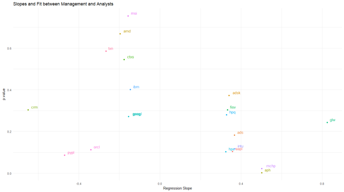
Another way to look at the same thing is a scatterplot. See PYPL lower left, along with ORCL. WordPress isn’t great with imported graphics, but I can send the original upon request.
Thanks for your consideration! Reach us at www.sentieo.com
Transcript Sentiment by Sector, Using the Tidyverse
What if we pulled the sentiment of management and analysts by sector, and used some nesting capabilities (tidyr) and mapped functions (purrr) married with base R’s lm() linear modeling to drill into the details?
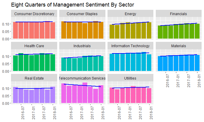
First, using Sentieo, I’m pulling eight quarters of transcripts for the S&P 500, and then applying some proprietary magic to parse management commentary vs analyst commentary, then applying sentiment analysis to these sections. The bars show quarterly positive – negative = total sentiment for each quarter.
And the same process for analyst sentiment:
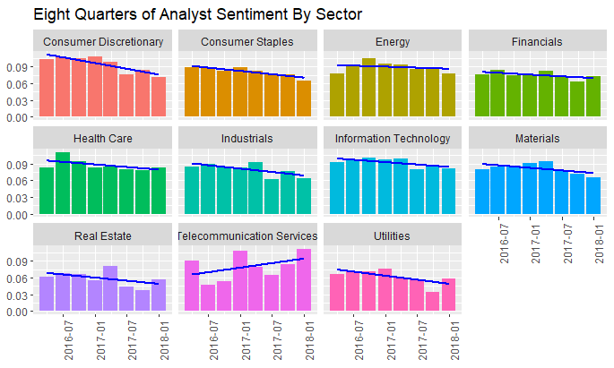
And while management commentary for most sectors is predictably stable, here we can see the interesting downtrend in analyst sentiment for the Consumer Discretionary sector.
Let’s dig into this a bit more:
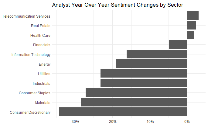
Just looking at the year on year changes, the downtrend in Consumer Discretionary is more clear. And we can dig into that specific sector to pull out the 10 biggest offenders, biggest deltas and best model fit. Easy to do, with the Tidyverse.
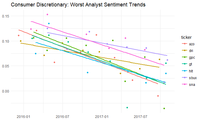
The code for which is of interest.
#create a nested tibble by ticker of analyst (non-management) sentiment.
nested_mgt<-df_sector_sentiment %>%
ungroup() %>%
filter(source==”*Non-Management*”) %>%
filter(sector==”Consumer Discretionary”) %>%
select(filingdate,ticker,sentiment) %>%
group_by(ticker) %>%
nest(-ticker)
#apply the tidyverse’s purrr library’s map function to regress sentiment against date.
nested_mgt_models<-nested_mgt %>%
mutate(model=purrr::map(data, ~ lm(sentiment ~ filingdate, data=.)))
#use the broom library to pull the beta for each ticker where the p-value is < 5%. keep the top 10 slopes.
library(broom)
p.value_models<-nested_mgt_models %>%
unnest(model %>% purrr::map(broom::tidy)) %>%
filter(term==”filingdate”) %>%
filter(p.value<.05) %>%
filter(estimate<0) %>%
arrange(estimate) %>%
head(10)
#use the reshape library to created a melted dataframe for plotting
library(reshape2)
df.melt<-df_sector_sentiment %>%
ungroup() %>%
filter(source==”*Non-Management*”) %>%
inner_join(p.value_models,by=”ticker”) %>%
select(filingdate,ticker,sentiment) %>%
melt(id = c(“filingdate”,”ticker”))
#lastly, using ggthemes, (for minimal()) plot the output.
library(ggthemes)
ggplot(data=df.melt,aes(x=filingdate,y=value,colour=ticker,group=ticker)) +
geom_point() +
geom_smooth(se=FALSE,method=”lm”) +
labs(title=”Consumer Discretionary: Worst Analyst Sentiment Trends”) +
theme_minimal() +
theme(axis.title.y=element_blank(),
axis.title.x=element_blank())
FOMC Minutes Sentiment Analysis using R (2012-2106)
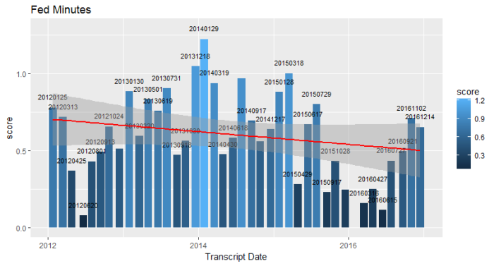
An interesting use of the “bing” lexicon and R web scraping would be to look at the minutes of the Federal Open Market Committee as they discuss the economy and the likely path of interest rates going forward.
https://www.federalreserve.gov/monetarypolicy/fomccalendars.htm
I’ve truncated this run as of year end 2016. As you can see the output is highly variable of late, and much of the commentary through late 2015 and 2016 was less bullish than in prior years. Indeed, the regression line suggests a general downward trend in tone since 2012.
I think a better implementation of this approach (besides spending more time with ggplot2 building a more readable chart) would be to use a market-driven lexicon, vs the one I’m using here.
Many thanks to the makers of the tidytext libray who made this possible:
https://cran.r-project.org/web/packages/tidytext/vignettes/tidytext.html
Monthly seasonality in S&P 500 components with R using a new library, tidyquant()
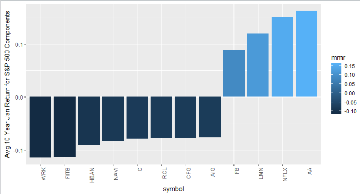
This is a chart of the average 10 year return in January for ALL S&P 500 stocks, filtered by returns greater or less than 7.5%. Think of it as your top and bottom January stocks, on average, over 10 years. Alcoa, Facebook top the list, and a couple of banks are at the bottom. Again, this is an exercise in functionality and the next step would be a deeper dive into each unique situation.
In my experience there’s actually a significant amount of monthly seasonality in individual stock returns. Homebuilder stocks, for example, typically outperform starting in October in advance of the “spring selling season” which, according to investing folklore, typically begins sometime after the Super Bowl ends and people get off the couch. In the case of the chart above, banks often use fourth quarter reports (issued in January) to “kitchen sink” their credit portfolios.
I’m always trying to keep an eye on the monthly seasonality of stocks I’m following.
Bloomberg has a great function “SEAG” which allows you to look at a nice graph of monthly returns for a single stock (use the heat map link under SEAG).
But of course, R is a great way of doing this type of analysis for multiple stocks, and, as usual, it’s really easy, in no small part thanks to a new R library called tidyquant() by Matt Dancho.
The tidyquant() library is brand new this month. Its significant advance is that it allows easy linkage between tibbles (a more recent design of dataframes in R used, for example, in the sentiment analysis I posted earlier this month) and traditional time series dataframes indexed by dates which are the legacy of R’s statistical roots. With tidyquant() you don’t need to transform back and forth between the old world dataframes and the new. Bravo!
It’s really cool to see how quickly and usefully the data science universe is evolving for securities analysts.
The best way to demonstrate all this is through the example of some easily readable code. Generating the chart above -> get a list of s&p 500 tickers using tidyquant(), then use that list to call a function which – again thanks to tidyquant() wrappers – filters by January (month ==1) and get the mean of that result? Simple:
library(tidyquant)
stocks <- tq_get(“SP500”, get = “stock.index”)
mean_monthly_returns <- function(stock_symbol) {
period_returns <- stock_symbol %>%
tq_get(get = “stock.prices”) %>%
tq_transform(ohlc_fun = Ad, transform_fun = periodReturn,
type = “log”, period = “monthly”) %>%
filter(month(date)==1)
mean(period_returns$monthly.returns)
}
stocks <- stocks %>%
mutate(mmr = map_dbl(symbol, mean_monthly_returns)) %>%
arrange(desc(mmr))
stocks
stocks %>%
filter(mmr > .075 | mmr < -.075) %>%
mutate(symbol = reorder(symbol, mmr)) %>%
ggplot(aes(symbol, mmr, fill = mmr))+
geom_bar(stat = “identity”) +
theme(axis.text.x = element_text(angle = 90, hjust = 1)) +
ylab(“Avg 10 Year Jan Return for S&P 500 Components”)
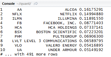
The output is a chart and a tibble:
Awesome!
Bibliography: R for Data Science by Wickham and Grolemund – Excellent intro to the tidyverse, and an essential read for any beginning R data science enthusiast.
Single Transcript Sentiment App
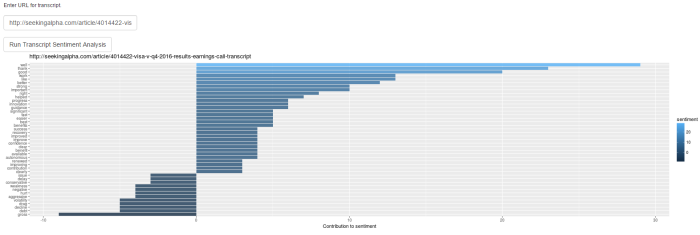
As a follow up to the historical transcript analyzer, here’s a single transcript app for reading sentiment from one URL.
It’s early days, so you have to paste the URL yourself. Example: http://seekingalpha.com/article/4014422-visa-v-q4-2016-results-earnings-call-transcript produces the output shown in the graphic above.
Here’s the link.
Thanks!
The January Effect Examined with R
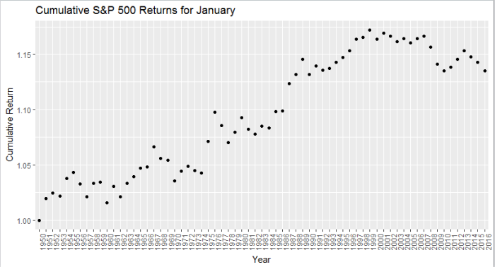
The January Effect is no more.
Since its discovery by investment banker Sydney Wachtel in 1942, the “January Effect” has come to mean an historical outperformance in the month of January, as investors tend to use December for tax loss harvesting (i.e., selling), and the absence of this negative leads to outperformance in the following month.
I wanted to take a look at this effect and see whether it still holds, because in my experience it’s been a pretty unreliable indicator.
Above, I’ve isolated the month of January going back to 1950, and pretty clearly the cumulative return of the strategy of investing in January alone peaked out sometime around 1998.
In the ’70s, professors Michael Rozeff and William R. Kinney Jr. examined average monthly returns of New York Stock Exchange stocks between 1904 and 1974. They found that the average monthly returns for January were more than five times greater than the average monthly returns of the other months.
However, since the ’70s, this effect has been either largely arbitraged, or mitigated due to better tax sheltering strategies.
Either way, be cautious if you’re counting on the January Effect.
Here’s the R code (My apologies for brevity of commenting):
library(quantmod)
library(ggplot2)
library(xts)
library(stringi)
getSymbols(‘^GSPC’,from=’1950-01-01′)
return<-Delt(Cl(to.monthly(log(GSPC))))
return[1]<-0 #remove the first NA
#calculate cumulative monthly returns for month 1
m_return <- as.data.frame(cumprod(return[which(format(index(return),’%m’)==’01’)]+1))
#some formatting
colnames(m_return) <- c(“Return”)
m_return$idu <- row.names(m_return)
#some plotting
p<- ggplot(data=m_return,aes(x=stri_sub(idu,-4,-1),y=Return))+geom_point()
p+theme(axis.text.x = element_text(angle = 90, hjust = 1))+xlab(“Year”)+ylab(“Cumulative Return”)+ggtitle(“Cumulative S&P 500 Returns for January”)
Bibliography
http://www.investopedia.com/terms/j/januaryeffect.asp
http://www.slate.com/articles/business/moneybox/2002/12/what_january_effect.html
