Beyond Correlations: A Simple Trading Dashboard for the Energy Sector

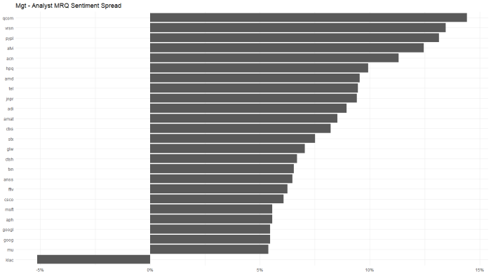
Another in a series of examples of R at work, this is a simple sector analysis of the energy sector in the S&P 500 using R and one of my favorite libraries: Tidyquant from the engineers at Business Science.  Check out their site – they have a bunch of great examples on how to use R in business.

I’ve been remiss of late including code, but I’ve added much of it to the bottom of this post in this case.  I’m happy to engage in discussion or debate with anyone else who has a passion for investing with data science tools.  I can be found on Linkedin, for now.  My github is coming soon.

Correlations?  Just the First Step

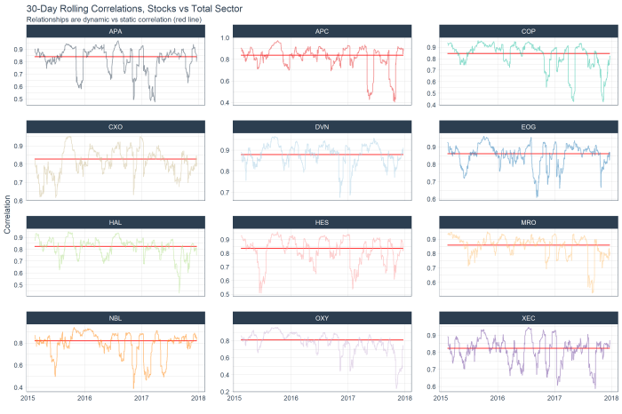
The following is the 30 day rolling correlation of the 34 stocks in the Energy sector with the S&P 500.

While the correlation fell through the year as oil prices declined and tech stocks rallied, the sector has shown increasing market correlation of late.

gplot_sp500_rolling.png

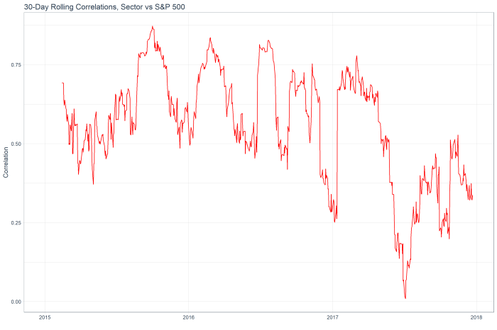
The following chart shows the top 12 stocks by correlation with the overall sector (red line) and their rolling correlation trend.  With this analysis alone, I don’t see much in the way of interesting ideas.  Everything appears to have mean-reverted already!

gplot_rolling_corr

However, we can dig deeper into the idea of relationships between stocks / sector by moving past correlations and into z-scores and regression model fits.

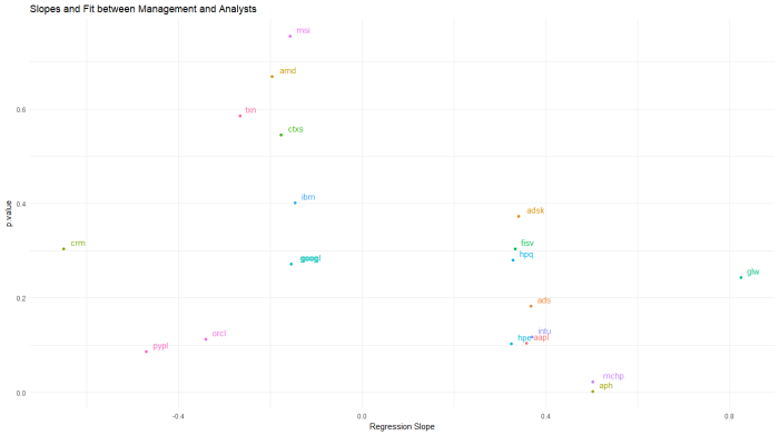
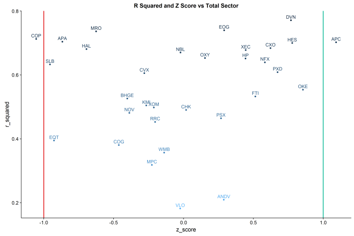
R Squared vs Z Score by Stock and Total Sector:
R Squared: The “goodness of fit”” of a linear regression of daily log returns by each stock against the total sector.

Z-Score: the measure of the current standard deviation of the daily spread of each stock’s return against that of the total sector.

Put the two ideas together, and you have a trading dashboard for the sector.

The lines in the chart are at the -1 and +1 standard deviations.

In this example, COP shows an r-squared of ~.75 and greater than -1 standard deviation from the mean of the sector, suggesting a mean reversion long. By contrast, APC shows an r-squared of ~.75 and a z-score of > 1, suggesting a mean reversion short vs the sector.

gplot_rsq_z

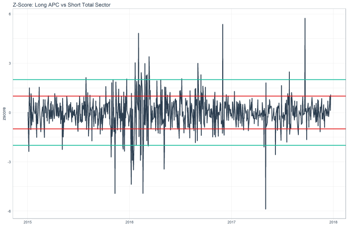
The z score chart for APC shows a mean reversion relative short, as the red line is 1 standard deviation out, and you can see this stock tends to mean revert.

gplot_one_stock

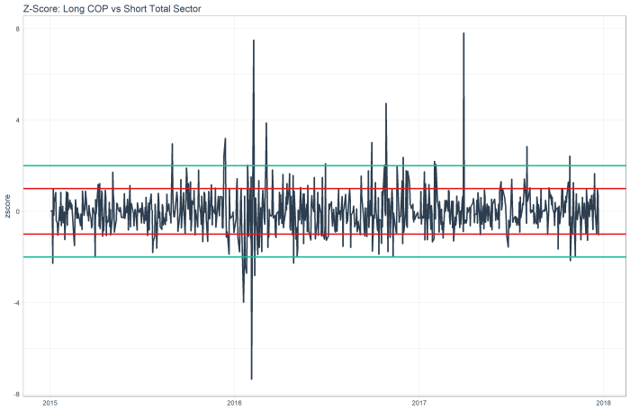
While the z score chart for COP shows a mean reversion relative long.

gplot_two_stock

Code below.  Ping me with any questions / ideas at jed at sentieo.com!


library(tidyquant)
sp500_stocks <- tq_index(“SP500″) #load sp500 stock symbols
stocks<-sp500_stocks %>%
filter(sector==”Energy”) #filter only the energy sector

#get prices
stock_prices <- stocks %>%
tq_get(get = “stock.prices”,
from = “2015-01-01”,
to = “2017-12-25”) %>%
group_by(symbol)

sp500_prices <- c(“^GSPC”) %>%
tq_get(get = “stock.prices”,
from = “2015-01-01”,
to = “2017-12-25”)

#calculate daily log returns
stock_pairs <- stock_prices %>%
tq_transmute(select = adjusted,
mutate_fun = periodReturn,
period = “daily”,
type = “log”,
col_rename = “returns”) %>%
group_by(date) %>%
mutate(average_sector=mean(returns)) %>%
ungroup() %>%
spread(key = symbol, value = returns)

#calculate daily log returns
sp500_returns <- sp500_prices %>%
tq_transmute(select = adjusted,
mutate_fun = periodReturn,
period = “daily”,
type = “log”,
col_rename = “returns”)

stock_returns_long<-stock_pairs %>%
gather(symbol,daily_return,-date,-average_sector)

#add rolling corr vs s&p
top_symbol<-stock_returns_long %>%
group_by(symbol) %>%
summarise(n=n()) %>%
head(1)

sp500_rolling_corr<-stock_returns_long %>%
filter(symbol==as.character(top_symbol[[1,1]])) %>%
select(date,average_sector) %>%
inner_join(sp500_returns,by=”date”) %>%
mutate(sp500_return=returns) %>%
tq_mutate_xy(
x = sp500_return,
y = average_sector,
mutate_fun = runCor,
# runCor args
n =30,
use = “pairwise.complete.obs”,
# tq_mutate args
col_rename = “rolling_corr”
)

stocks_rolling_corr<-NULL
stocks_rolling_corr <- stock_returns_long %>%
na.omit() %>%
group_by(symbol) %>%
# Mutation
tq_mutate_xy(
x = daily_return,
y = average_sector,
mutate_fun = runCor,
# runCor args
n =30,
use = “pairwise.complete.obs”,
# tq_mutate args
col_rename = “rolling_corr”
)

####GENERIC MODEL FIT
r_squareds<-stock_returns_long %>%
nest(-symbol) %>%
mutate(model=purrr::map(data,~lm(daily_return~average_sector,data=.))) %>%
unnest(model %>% purrr::map(broom::glance)) %>%
select(symbol,r.squared)

z_score<-function(data) {
data<-data %>%
mutate(z_score=(diff_series-mean(data$diff_series))/sd(data$diff_series)) %>%
select(date,z_score)
return(data)
}

current_z_scores<-stock_returns_long %>%
mutate(diff_series=daily_return-average_sector) %>%
nest(-symbol) %>%
mutate(zscore=purrr::map(data,z_score)) %>%
unnest(zscore) %>%
filter(date==max(date)) %>%
arrange(z_score)

#PLOT RSQ and ZSCORE
gplot_rsq_z<-inner_join(r_squareds,current_z_scores,by=”symbol”) %>%
mutate(r_squared=r.squared) %>%
ggplot(aes(y=r_squared,x=z_score,colour=-r.squared)) +
geom_point() +
geom_text(aes(label=symbol),size=4,vjust=-.5) +
geom_vline(xintercept = -1, size = 1, color = palette_light()[[2]]) +
geom_vline(xintercept = 1, size = 1, color = palette_light()[[3]]) +
labs(title=”R Squared and Z Score vs Total Sector”) +
theme(legend.position=”none”)


More Transcript Sentiment with R: Information Technology Sector

Adding to the previous post on transcript sentiment, I took a deeper dive into the popular Information Technology sector, using data and analysis from the parsing engines at Sentieo, the R libraries tibbletime,  tidyverse, and a cool brand-new package of palette colors called dutchmasters.

As usual, I’ll keep the commentary very concise, but feel free to reach out to me (jed at sentieo.com) to discuss my favorite topic: investing with data (and a little science).

This busy chart below shows the various stocks in the sector with eight quarters of management sentiment, along with a blue regression slope lm() line.  We can see stocks like ACN and ADBE and VRSN with clear uptrends, contrasted by downtrends in INTU, FIS, and MSI.  We’ll return to this chart later.

tech_8_mgt


Running the same analysis for analyst sentiment, we see uptrends at IBM, ADP and DXC, and downtrends at NVDA, ACN, and VRSN.

tech_8analyst

For a quick look at which stocks had the biggest changes (>10%) quarter over quarter, for management …

qoq_mgt

and analysts…

qoq_analyst

analysts got a lot more bullish on ADP and a lot less on QCOM.  Oddly, QCOM management had the opposite change in their commentary.  This type of divergence is worth digging into.

Looking at the chart below, QCOM, VRSN and PYPL had the largest divergence between positive managements and more negative analysts quarter to quarter.  KLAC showed the opposite trend.

mgt_analyst_spread

Looking at a longer 8 quarter trend of management sentiment, the worst slopes occur for PAYX and ORCL.

worst_8_mgt

Which begs the question of – ok those are the slopes but what are the model fits for these individual stocks … that is, for which of these slopes is the regression actually significant.  I wrestled with this issue for a bit, and landed on the following chart which shows p-value (loosely, goodness of fit) as color and with a label for the worst sentiment trend stocks in the Tech sector.  ORCL stands out as having a significant and statistically significant downtrend.

worst_8_mgt_pvalue

Applying the same approach to the analyst data:  QCOM STX and VRSN are unpopular.worst_8_analyst_trends

But the best model fits are PAYX AVGO and LCRX for negative trends.

worst_8_analyst_pvalue

And, in an attempt to put it all together, I regressed management sentiment against analyst sentiment in a similar approach to the p-value charts above.

The significance of this chart is PYPL shows the biggest statistically significant divergence between management and analyst sentiment over an 8 quarter period (I’d prefer to see p-values < .05 per the rule of thumb applied to this stat, but simply speaking on an ordinal basis).  Recall from the first two charts in this post that PYPL had showed a modest uptrend in management sentiment and a modest downtrend in analyst sentiment.  These data alone suggest a nearly-good fit on p-value and a divergent trend worth digging into more.

last_chart

Another way to look at the same thing is a scatterplot.  See PYPL lower left, along with ORCL.  WordPress isn’t great with imported graphics, but I can send the original upon request.

scatter

Thanks for your consideration!  Reach us at www.sentieo.com


Transcript Sentiment by Sector, Using the Tidyverse

What if we pulled the sentiment of management and analysts by sector, and used some nesting capabilities (tidyr) and mapped functions (purrr) married with base R’s lm() linear modeling to drill into the details?

First, using Sentieo, I’m pulling eight quarters of transcripts for the S&P 500, and then applying some proprietary magic to parse management commentary vs analyst commentary, then applying sentiment analysis to these sections.  The bars show quarterly positive – negative = total sentiment for each quarter.

mgt_8

And the same process for analyst sentiment:

analyst_8

And while management commentary for most sectors is predictably stable, here we can see the interesting downtrend in analyst sentiment for the Consumer Discretionary sector.

Let’s dig into this a bit more:

analyst_yoy

Just looking at the year on year changes, the downtrend in Consumer Discretionary is more clear.  And we can dig into that specific sector to pull out the 10 biggest offenders, biggest deltas and best model fit.  Easy to do, with the Tidyverse.

analyst_trend

The code for which is of interest.

#create a nested tibble by ticker of analyst (non-management) sentiment.

nested_mgt<-df_sector_sentiment %>%
ungroup() %>%
filter(source==”*Non-Management*”) %>%
filter(sector==”Consumer Discretionary”) %>%
select(filingdate,ticker,sentiment) %>%
group_by(ticker) %>%
nest(-ticker)

#apply the tidyverse’s purrr library’s map function to regress sentiment against date.

nested_mgt_models<-nested_mgt %>%
mutate(model=purrr::map(data, ~ lm(sentiment ~ filingdate, data=.)))

#use the broom library to pull the beta for each ticker where the p-value is < 5%.  keep the top 10 slopes.

library(broom)

p.value_models<-nested_mgt_models %>%
unnest(model %>% purrr::map(broom::tidy)) %>%
filter(term==”filingdate”) %>%
filter(p.value<.05) %>%
filter(estimate<0) %>%
arrange(estimate) %>%
head(10)

#use the reshape library to created a melted dataframe for plotting

library(reshape2)
df.melt<-df_sector_sentiment %>%
ungroup() %>%
filter(source==”*Non-Management*”) %>%
inner_join(p.value_models,by=”ticker”) %>%
select(filingdate,ticker,sentiment) %>%
melt(id = c(“filingdate”,”ticker”))

#lastly, using ggthemes, (for minimal()) plot the output.

library(ggthemes)
ggplot(data=df.melt,aes(x=filingdate,y=value,colour=ticker,group=ticker)) +
geom_point() +
geom_smooth(se=FALSE,method=”lm”) +
labs(title=”Consumer Discretionary: Worst Analyst Sentiment Trends”) +
theme_minimal() +
theme(axis.title.y=element_blank(),
axis.title.x=element_blank())